Two Saints Winery | Wine Labels
I had the opportunity to lead the redesign of a local winery’s product line in Iowa, with a goal of modernizing their branding and expanding their reach. The client wanted to refresh their wine labels to better appeal to their target market and create a cohesive identity across their existing and future varieties.
Original Labels
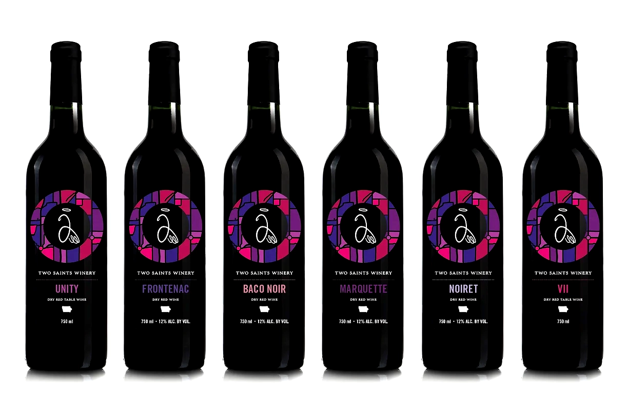
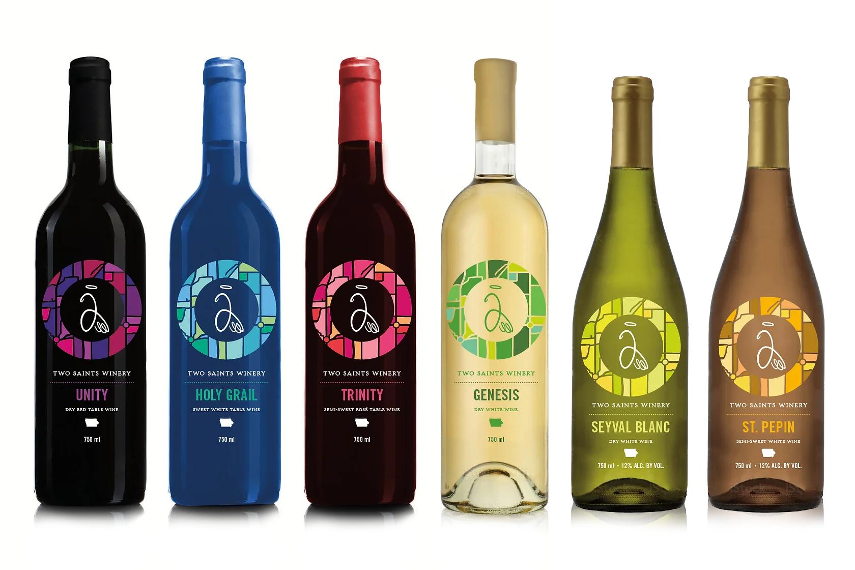
Through a collaborative process, several design concepts were presented, but ultimately, the client was encouraged to take the brand in a new direction that would resonate more with consumers and reflect the winery’s local charm and heritage. The selected design struck a balance between unifying the current product line and offering flexibility for future growth, ensuring the winery could seamlessly add new varieties while maintaining consistency across the brand. The new look has a visual nod to the winery’s location between two towns, St. Charles and St. Marys, by using an abstract map of their location. The impetus of their name now was wrapped into a fully integrated bottle label concept.
The new design brought a fresh, contemporary look to the winery’s packaging, emphasizing its local roots while allowing the brand to evolve with the market. It not only provided clarity and cohesion but also helped the client better position their products for broader consumer appeal and long-term brand success.
Updated Labels


My roles:
Idea generation
Art direction
Packaging
Client guidance
Print setup
Overseeing print production

