Flying Dutchman | Liquor Labels
For Flying Dutchman Distillery, I had the opportunity to design a series of distinctive bottle labels for their premium liquor line, inspired by the founders' shared passion for private aviation. This insight became the cornerstone of the design, infusing the brand with a sense of adventure and flight.
-

Brand Integration
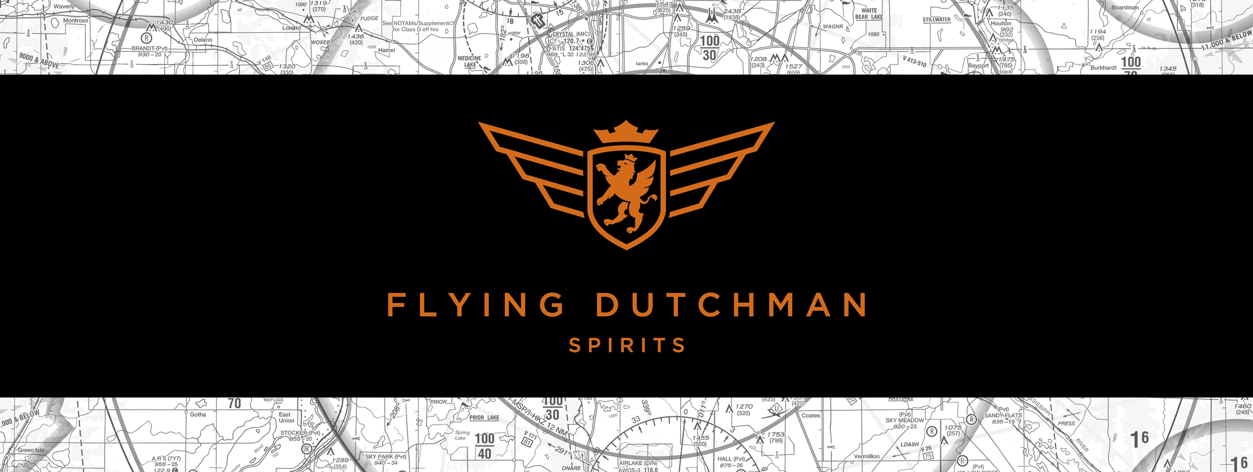
The distillery’s logo was thoughtfully crafted by another brand team member to reflect the aviation theme, incorporating elements that evoke the spirit of flight and the founders' passion for aviation.
-

An Integrated Concept
A subtle yet impactful detail, I integrated a transparent aviation map of the Minneapolis area into the background of the label. This hidden "easter egg" speaks to the owners' love for flying and adds a layer of storytelling to the design.
-

Unique Label Design
The label’s shield design is intentionally opaque, with a white backing that allows the taste notes of the liquor to be easily read through the back of the bottle, creating a functional and unique touch.
-

Color System
I developed a cohesive color palette for the entire product line, balancing consistency with differentiation. Each label's color was carefully chosen to maintain brand unity while also allowing each liquor variety to stand out on the shelf.
This design approach not only reflects the brand’s story but also creates a visually appealing and functional label that invites curiosity and enhances the overall consumer experience. The final result is a set of bottles that feel as refined and adventurous as the liquors inside them.
My roles:
Idea generation
Art direction
Packaging
Client guidance
Print setup
Overseeing print production

